October Poster Series
October marked the start of my October Poster Series — a personal project where I challenge myself to design one poster every day throughout the month. Each piece begins with whatever comes to mind, no rules or themes, just an open space to explore new ideas and experiment freely.
The goal is simple:
- Carve out time each day for creativity
- Push myself to try new techniques
- Rediscover the joy of making something just for the sake of creating
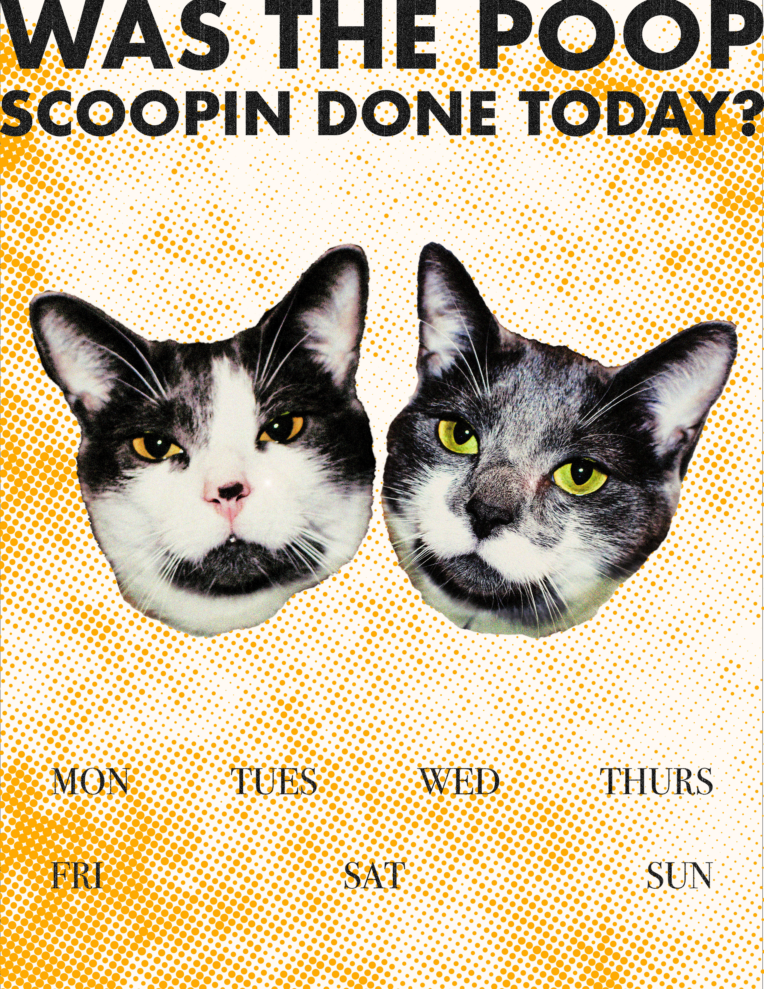
Poster 01: Cat Chores
For the first poster, I wanted to design and laminate something practical, a fun way to keep track of when the cat chores get done. The idea was to make it a little humorous and eye-catching so it would actually grab my attention and remind me to stay on top of things.
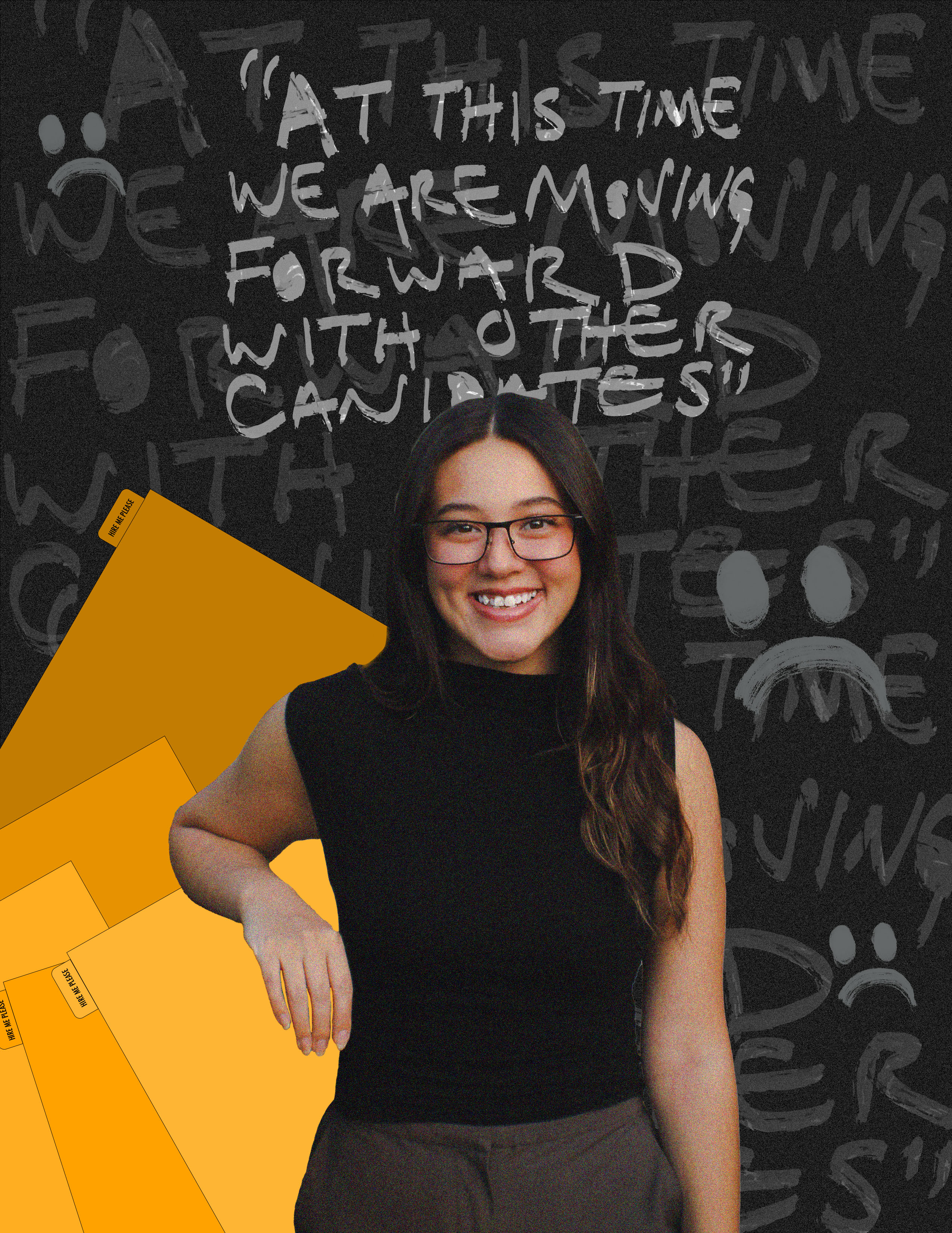
Poster 02: Job Search
Poster two, I wanted to capture how I was feeling about the job search. After being let go, I was still trying to stay hopeful and bright, but most days felt full of uncertainty and disappointment. This design became a way to express that mix, staying positive while acknowledging how discouraging the process can feel. It was simply an honest reflection of where I was that day.
Poster 03: Bite Me
For this poster, I had just found the charger for my camera batteries and started taking photos again after a long break. This picture was captured of my cat, Winnie, mid-yawn — and it instantly felt like the perfect image to play with. I decided to turn it into something a little edgier and grittier for day three, mixing that candid, funny moment with a bold design style.

Poster 04: Running Out of Time
Poster four, I couldn’t get Running Out of Time by Tyler, the Creator out of my head, so I decided to turn that energy into a design. I started with the image of a clock, the first thing that comes to mind when I hear the song, and manipulated it to feel a bit distorted and urgent. I used red and green to create strong contrast between the text and the clock, adding to that feeling of tension the song gives me.

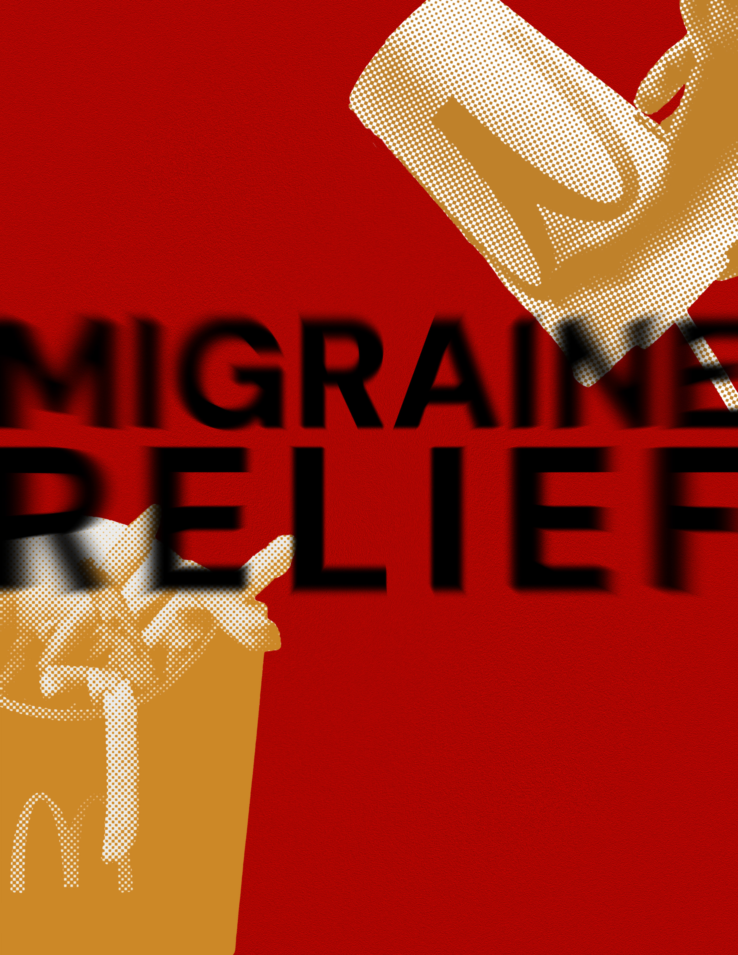
Poster 05: Migraine Relief
I’ve had migraines since I was about twelve, and recently my dad mentioned his “hack” for getting rid of them: a large McDonald’s Coke and fries. The mix of salt and caffeine, the perfect cure. I thought the idea was funny, but every once in a while I still give it a try… and surprisingly, it does help.
Since this was one of my migraine days, I decided to turn the idea into a poster. It felt like the right mix of humor and honesty, and I got to experiment with type in a new way, my first time trying this particular method.
Poster 06: Sticker Collection
I had just finished setting up my very first sticker pack drop, so with stickers on my mind, this poster became a celebration of collecting. For Poster 06, I wanted to capture that feeling of being a sticker enthusiast, surrounded by color, texture, and personality. I even included some of my own sticker designs in the background, experimenting with type pairing and layered textures to bring the composition to life.

Poster 07: Seeing Stars
Poster seven, I started with another photo I took on my camera, a close-up of my cat, Winnie. I zoomed in to focus just on his eyes, using the image as a way to experiment with lighting, contrast, and texture. I created a star-like shape above his eyes and played with light and blur to give the piece a soft, surreal quality. This one was all about image manipulation, exploring composition and mood rather than focusing on type or color.


