VIDS Corp.
In 2023, I joined VIDS Corp. as a contract worker. The company was seeking a fresh, modern identity to better reflect its vision and stand out in their industry. Collaborating closely with the team, I played a key role in reimagining and redefining the company’s visual presence.
Revitalize the existing brand to give it a more modern, streamlined look that reflects the company’s forward-thinking vision. The goal was to retain the symbolic arrow, which represented progress and advancement, but simplify the overall logo for a more cohesive and contemporary design. The previous color palette, which featured baby blue and white, no longer resonated with the company’s evolving position within the defense industry. We aimed to develop a color scheme and visual identity that better aligned with the industry’s professional standards while still clearly conveying the company’s core message of innovation and reliability.
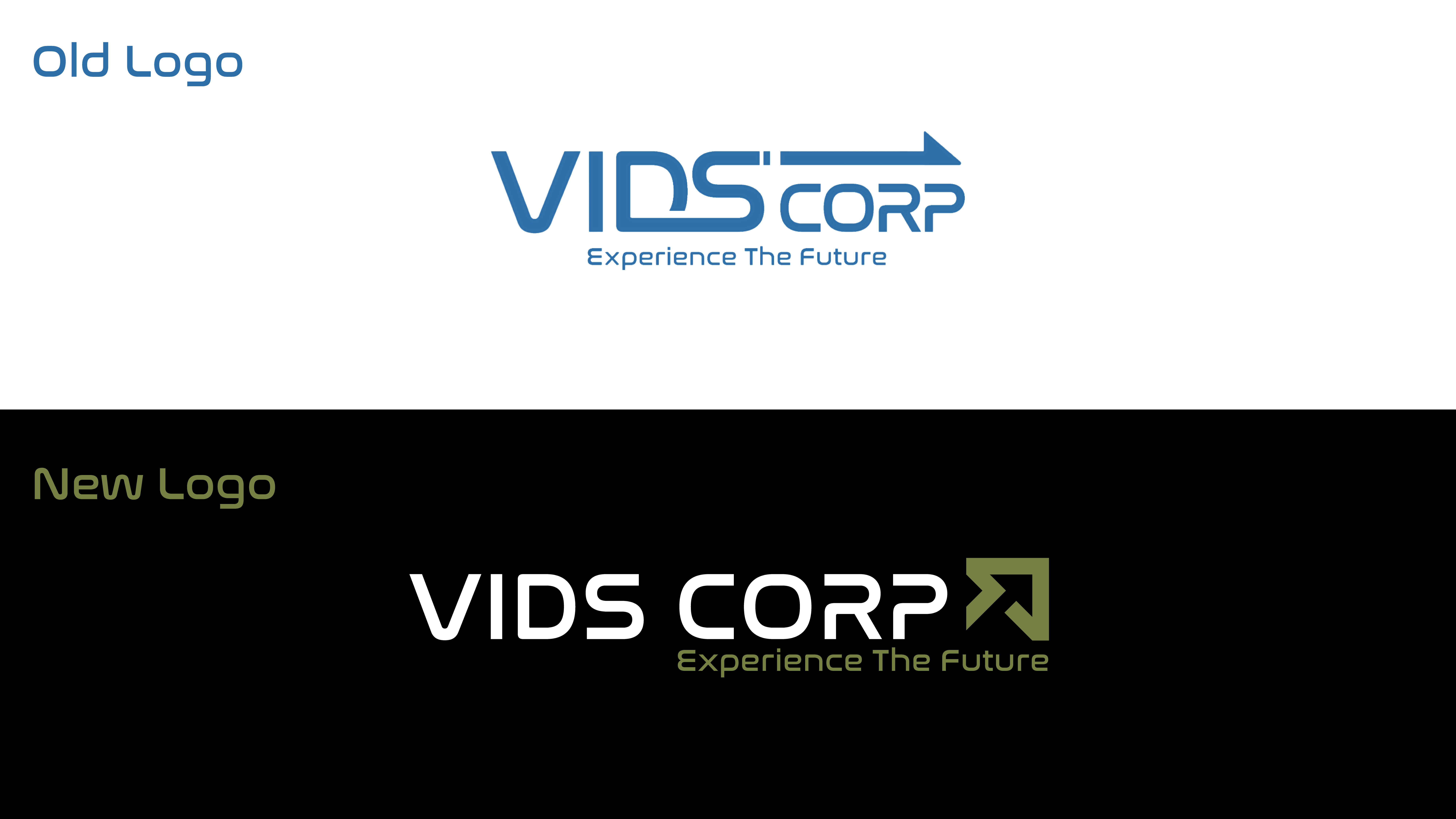

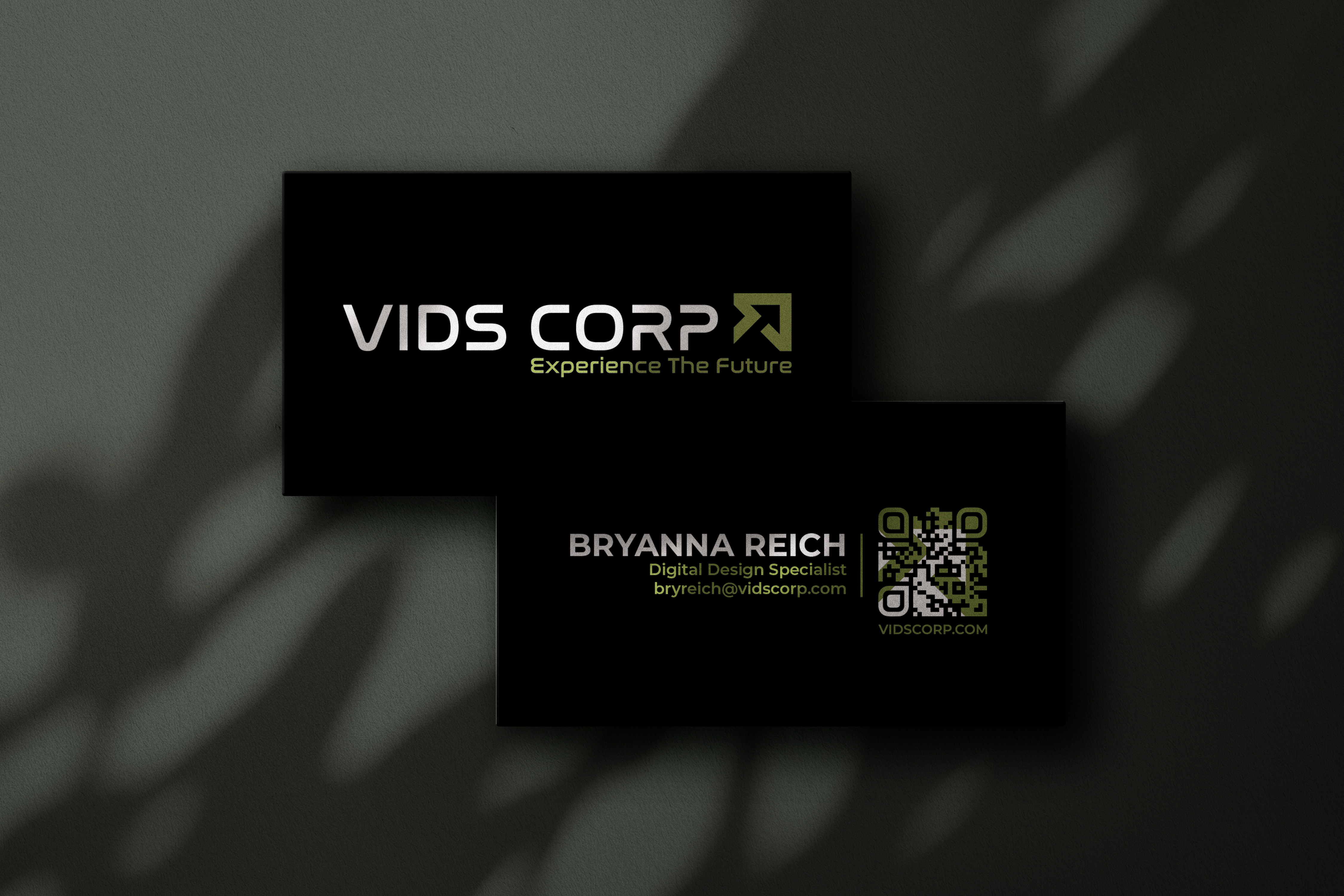
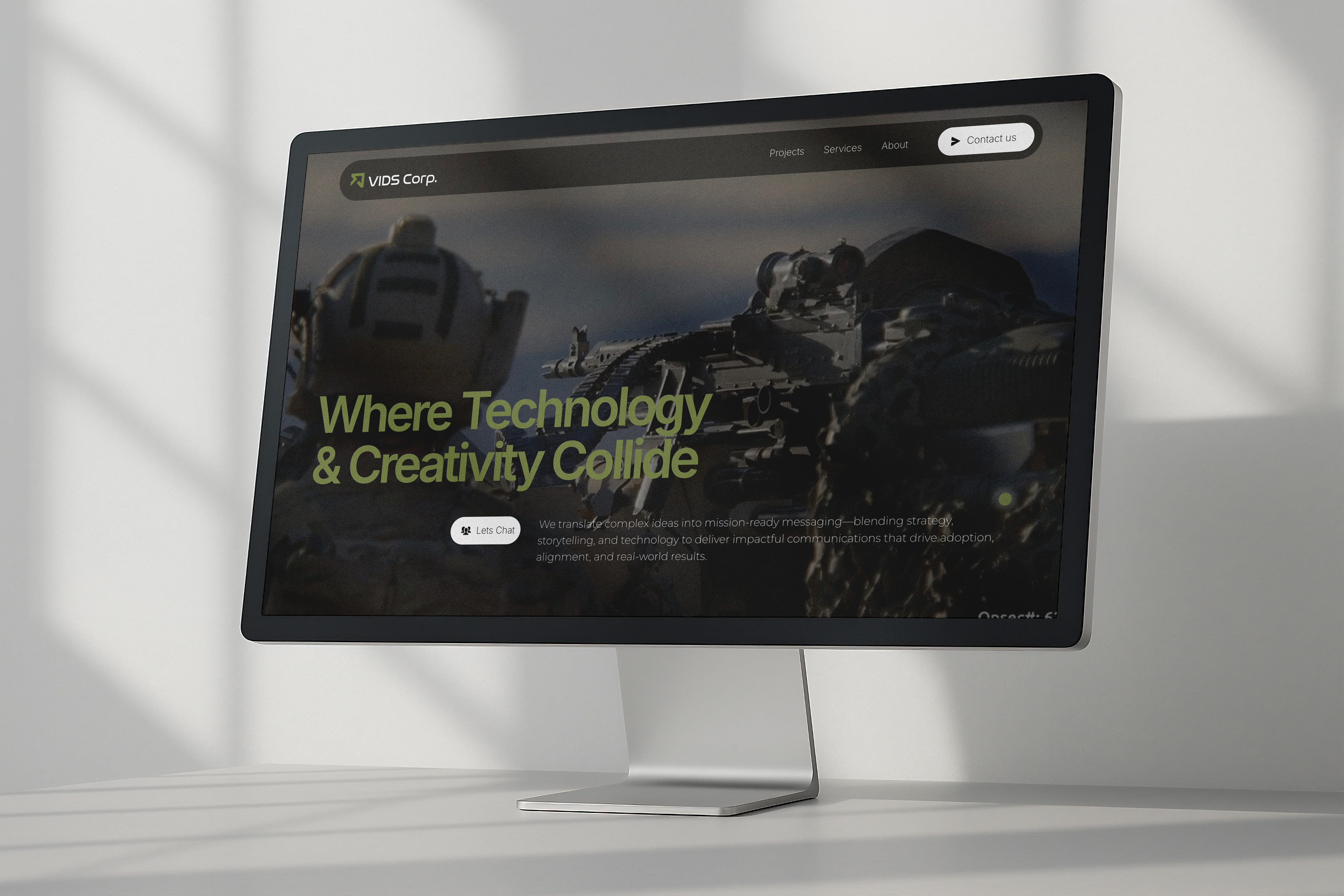
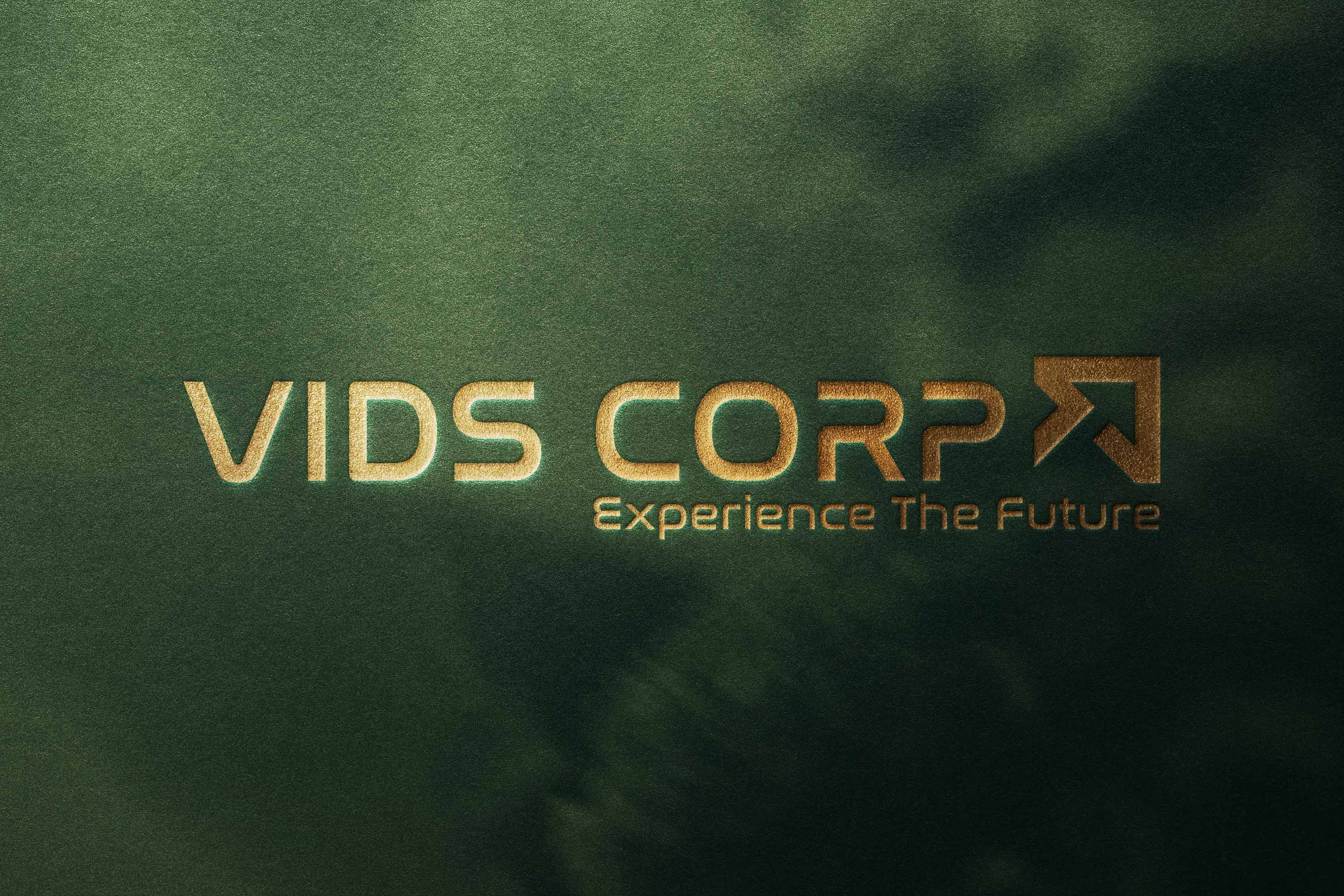
The brand evolution delivered a sleek, modern visual identity that aligns with VIDS Corp.’s future-focused vision. We preserved the original typeface for the logo to maintain simplicity and consistency, and reimagined the VIDS arrow as a standalone, upward-pointing mark—flexible in a square format for digital and print. An olive-green palette was chosen to echo the defense sector while signaling growth, strength, and innovation. The refresh included print collateral and a redesigned website which you can see at vidscorp.com .